|
The "Focus™ Topics, Roadmaps, Actions" manual brings you up-to-speed with the Focus™ main functionality.
If you want a structured introduction to managing topics, roadmaps and actions, just read on.
Roadmaps
Roadmaps are the main element of Focus™.
They are essentially collections of topics below a focused topic, arranged on a timeline.
The focused topic thereby defines the starting point of the timeline (by its "Timing" attribute).
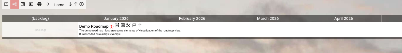
If you invoke the roadmap view from either the top-level menubar, the home screen or the main menu, you are actually focusing on the top-most topic in Focus™: the "Home" topic.
The "Home" topic serves as the starting point for your own collection of roadmaps and is empty at the beginning (except for the presence of the "Demo Roadmap", which is a simple example):
(Focus™ Roadmap Home Screen)
We now create our first roadmap here.
It is actually as simple as clicking the  "Add" button in the breadcrumb on top of the screen. "Add" button in the breadcrumb on top of the screen.
The topic editor will appear, containing a new and mostly empty topic:
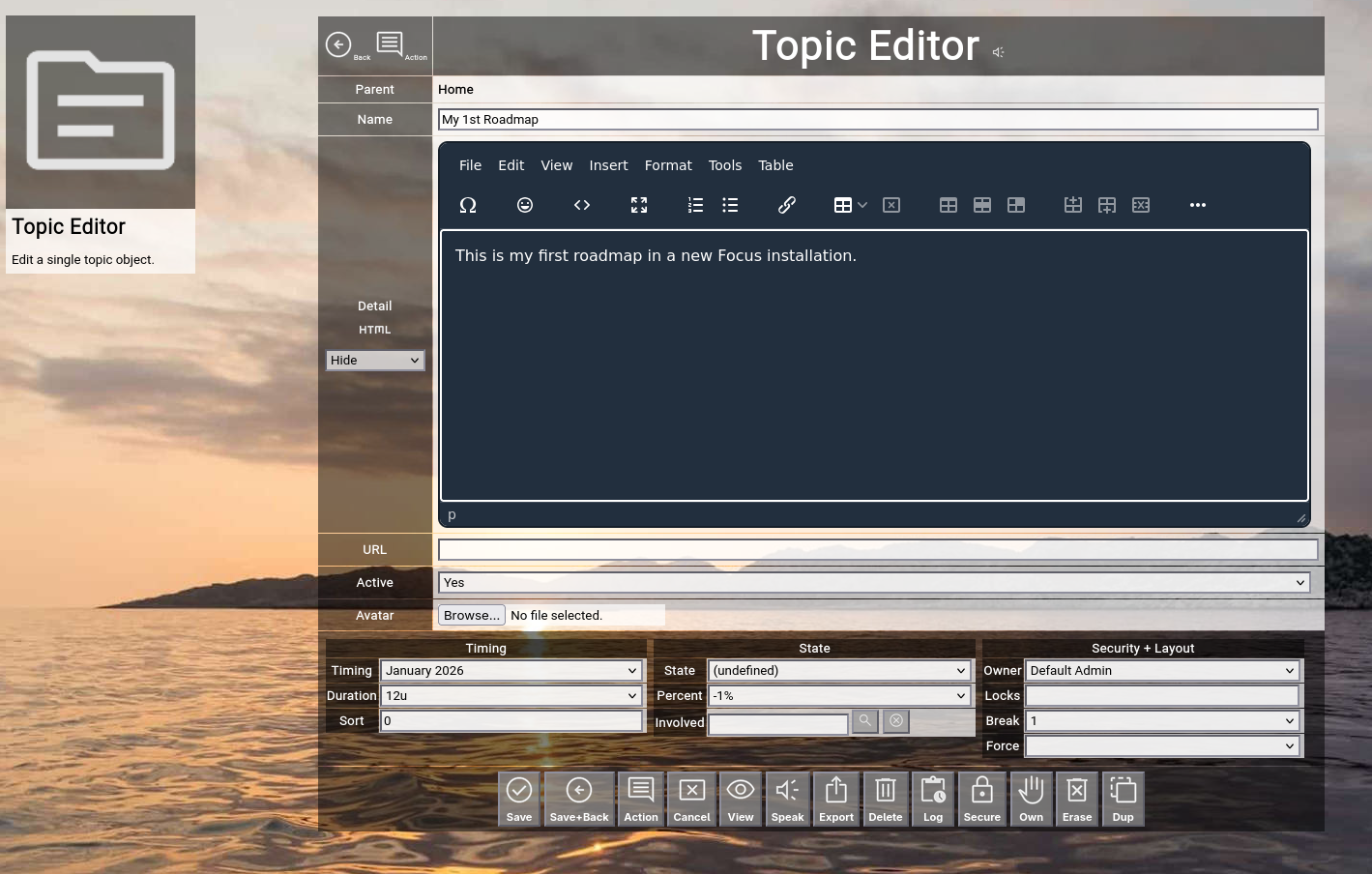
(Focus™ Topic Editor Screen with a new and mostly empty topic becoming a roadmap)
To create a roadmap, you have to fill in the following fields as a minimum:
- Name
The name of the roadmap, in our example "My 1st Roadmap".
- Detail
A short description of the roadmap.
- Timing
The starting timing of the roadmap (in our example "January 2026".
- Duration
The optional duration of the roadmap (in our example "12units", which are 12 months).
Finally, click the "Save+Back" button to return to the previous screen.
You will now see your newly created topic, representing a roadmap:
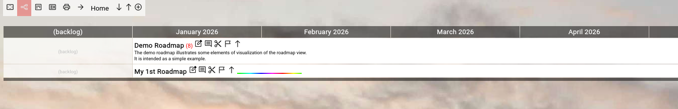
(Focus™ Roadmap View with a newly created roadmap)
You will also notice the animated "rainbow bar"; it always appears next to the topic on a roadmap, which has been last edited.
If you have a large and complex roadmap (which also involves scrolling in the browser window), this helps you to get back into context after editing a topic ("resuming where you left off").
Congratulations!
Your first roadmap just became reality.
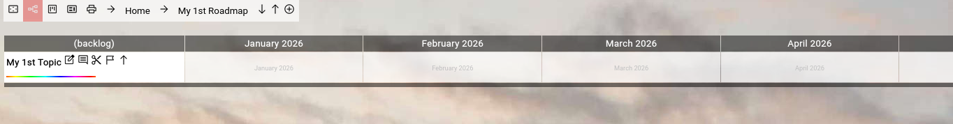
Now, you click on the name of your new roadmap, to focus on it (or to "enter" it):

(Focus™ Roadmap View after having focused your new roadmap)
You will notice several things:
- There are no topics on your roadmap yet.
This is not surprising, as you focused on a newly created roadmap.
- The breadcrumb on top of the screen now shows the path "Home ⇒ My 1st Roadmap".
You can use the breadcrumb to navigate back to "Home" by clicking on it or to refresh your focused "My 1st Roadmap" by clicking on it.
Now you are ready for some serious business.
Click the "Add" button in the breadcrumb again, to create your first topic on the roadmap:

(Focus™ Topic Editor creating the 1st topic)
This time, just enter a name and a detail for the topic and click the "Save+Back" button.
You will notice, that the new topic is automatically placed in the "Backlog" column, because we did not select any timeline:
(Focus™ Roadmap View after having added the 1st topic)
Now click the  "Edit" button next to the 1st topic to re-edit it. "Edit" button next to the 1st topic to re-edit it.
Select a timeline, a duration and the state "Planned":
(Focus™ Topic Editor creating the 1st topic)
Click the "Save+Back" button to return to the roadmap:
(Focus™ Roadmap View after having edited the 1st topic)
Now create a couple of more topics on your roadmap, with different timings.
The resulting view may look like that:
(Focus™ Roadmap View after having added a couple of more topics)
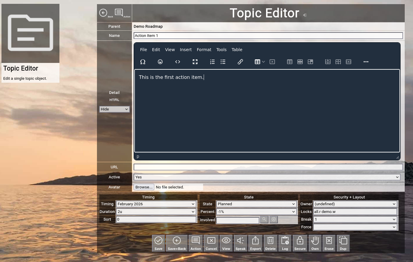
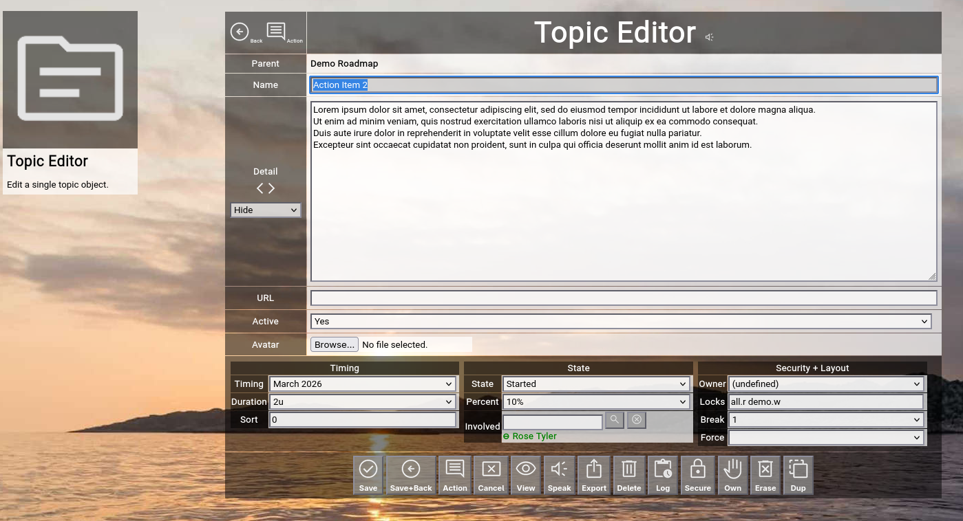
Topic Editor
You should already have a good grip on the typical topic editing cycle on a roadmap by now.
It is time to give an overview of all the attributes in a topic:
(Focus™ Roadmap Editor)
In the left-upper corner, you will see two buttons.
The "Back" button allows you to go back to the previous screen (normally the roadmap view) without saving any changes.
The "Action" button switches directly to the action log of the topic (explained later).
Clicking on the "Topic Editor" headline will reload the screen, in case you want to refresh or throw away any field entries you already made.
- Parent
The name of the topic above the currently edited topic.
This is usually the roadmap on which you are working or (if you created a topic inside of another topic) the parent topic.
The parent topic cannot be edited here; use the cut+paste functionality to move it on the roadmap (explained later).
- Name
The full name of a topic.
If you define a topic which represents activity, it is good practice to use a combination of a verb and an object (for example "Create 1st Concept").
- Detail
The detail of a topic.
It can be everything from one sentence up to a full HTML-formatted document.
On the left, just below the "Detail" label, you can see the  "Plain" icon. "Plain" icon.
This allows you to toggle the embedded HTML WYSIWYG editor (explained later).
The selector below allows you to switch between "Hide", "OnRoadmap", "OnFocus" or "OnBoth" of the text on the roadmap.
"OnRoadmap" will render a preview of the details inside the roadmap item.
"OnFocus" will render the full details when the topic is focused ("drilled into").
"OnBoth" will activate both options.
- URL
The optional URL of a topic.
If you paste an URL here, it will be displayed as a link icon on the roadmap (you can use this to for example point to existing documentation in a Wiki or to a related ticket in a ticketing system).
- Active
By default, a topic is active.
You can deactivate it and its name will be displayed in a strikeout format in the roadmap.
This functions as a "soft delete", if you are not sure yet to completely delete a topic.
- Avatar
An optional attachment to the topic.
If you select a JPG, PNG or GIF file here, it will be rendered as an avatar left of the name of the topic on the roadmap.
If you select for example a PDF file, a download button will be shown instead.
To upload an attachment, just select a local file and save the topic later in your edit cycle.
- Timing
- Timing
The timing is the starting slot on the pre-defined timeline used for all your roadmaps.
The default after creation of a topic is "(backlog)", and all topics with that timing will appear in the backlog column of a roadmap with a duration of 1u.
Selecting a different pre-defined timing will move the starting position on the roadmap into the future.
Remember: Usually the timing slots on the pre-defined timeline represent months (it is a best practice for planning and tracking on management level).
But you could also use calendar weeks or sprints, depending on the needs of your use case.
- Duration
The duration of a timing represents its length in units (usually months).
If you do not select anything here and leave it at zero, it will default to 1 unit on the roadmap.
- Sort
By default, topics are sorted by timing and then alphabetically by the name of the topic when rendered on a roadmap.
You can optionally set the sort, which overrides alphabetic sorting after the timing.
If you have for example 5 topics which all start in February 2026 and you want one topic to always be on top of the other 3, you can set a sort of -1.
- State
- State
The state represents a color-coded phase in the lifecycle of a topic.
It usually is something like "planned", "started", "progressing" or "done", with an individual color assigned to each of them.
An optionally associated completion percentage will also automatically set the completion percentage of the topic, when you change the state.
States can be individual for your company (meaning for your instance of Focus™), but the set of pre-defined states is always the same for every roadmap (as state is something fundamental and maximum flexibility here creates maximum confusion).
- Percent
The estimated percent completion is your personal estimation of how much of the entire cake has already been eaten.
It is rendered as a percentage bar on the roadmap and purely serves the purpose of communicating how much of something has already been done.
- Involved
If you work in a team, you can involve other people in your topic (they either contribute something or take the lead).
Just enter part of a name here (or part of the keys of users) and hit "enter" to view a list of matching names.
Then click on a name on the list (with a ⊕ in front of it) to add it to the list of involved people.
To remove a name from the list again, just click on a green name in the list (with a ⊖ in front of it).
Involved people are rendered as their avatar on the roadmap.
- Security + Layout
- Owner
The owner of a topic is the person who initially created a topic.
It can only be changed directly by an administrator.
Owners have full access rights to the topic, independent of the locks assigned to the topic.
- Locks
The locks of a topic define additional access rights to it (which is important in a collaborative environment).
Only owners of a topic or people with super access rights are able to change the locks of a topic.
For a full explanation on how keys and locks work together, see the separate section further down in this manual.
- Break
The break of a topic is only relevant, if you use the Contextchart view and it affects the items contained in the topic.
By default, it is set to 1.
In Contextchart view, this forces a line break after every item, so that topics are aligned vertically.
If you set this to for example 3, the line break is forced every 3 items, so that topics are aligned in triplets.
If you set this to 99999, no line break is forced, so that topics are effectivly aligned horizontally.
- Force
By default, you can dynamically switch between Roadmap view, Kanbanboard view and Contextchart view (with the help of the buttons in the breadcrumb).
With the force option of a topic, you can force a pre-selected view mode when focusing the topic.
This option will affect all topics below, across different hierarchy levels.
Force options set on topics below will override the setting inherited from above.
The "Flex" option will revert back to flexible selection of view mode starting with the topic on which it is set.
Please be aware that this is an advanced feature which should be used with care.
The following buttons are available at the bottom of the screen:
- The "Save" button will just save your changes (without leaving the editor screen).
This is only possible with write access level to the topic.
- The "Save+Back" button will do the same but return to the previous screen.
This is only possible with write access level to the topic.
- The "Action" button will do the same and jump to the action overview of the current topic.
This is only possible with write access level to the topic.
- The "Cancel" button will just return to the previous screen (without saving; it functions in the same way as the "Back" button in the upper-left corner).
- The "View" button will temporarily switch to "read only" mode, so that you can for example easily read long HTML-formatted details.
This is only relevant, if you have write access to the topic; if you only have read access, it will show "read only" mode anyway.
- The "Speak" button will try to speak the topic details with the help of the browser speech synthesis API (which is an experimental feature of Focus™ at the moment).
- The "Export" button will export the topic and all topics recursively below to a local file in either ZML format (which can be re-imported by an administrator) or in CSV format (which can be imported into a spreadsheet program like Excel™).
- The "Delete" button will request confirmation, will delete the record and then will return to the previous screen.
Note: Deleting a topic is only possible, if the topic is not yet used somewhere in Focus™ already; if this is the case, you will see an appropriate error message.
This will happen for example if the topic you are trying to delete already contains other topics.
Furthermore, this is only possible with write access level to the topic.
- The "Log" button will show the full historical transaction log for the topic (who+when+what regarding updates).
This can be used for example to clarify who in the team switched the state to "done" or something like that.
- The "Secure" button will request confirmation and will apply the "Locks" attribute of the current topic to all topics recursively below the current topic.
This is only possible with super access level to the affected topics and allows you to change the access security of an entire topic branch at once.
- The "Own" button will request confirmation and will apply the owner of the current topic to all topics recurisvely below the current topic.
This is only possible with super access level to the affected topics and allows you to change the ownership of an entire topic branch at once.
- The "Erase" button will request confirmation, will delete the topic and all topics recursively below and return to the previous screen.
This will effectively wipe out an entire branch of topics (for example: an entire roadmap with all its content).
Therefore this is only possible if you have write access to all related topics and if you own the "expert" key as a user (to prevent accidential mishaps).
- The "Dup" button will request confirmation, will duplicate the topic and all topics recursively below and return to the previous screen.
The new topic branch is name with an appended "(copy)" in its name.
This will effectively duplicate an entire branch of topics (for example: you have created a template which you want to use for new roadmaps; you can easily duplicate it and then cut+paste it somewhere else).
Again, this is only possible if you own the "expert" key as a user (as it represents a "mass data operation").
Locks and Keys
We already shortly touched the "Owner" and the "Locks" fields in the previous section of this manual.
These two fields together govern the access to the individual topic.
User Keys
Every user in Focus™ can possess a number of so-called "keys".
Every key is a unique word.
The key field of a user record can contain a space-delimited list of 1..N keys.
Keys of a user can only be maintained by administrators of the Focus™ instance.
A valid example for a list of user keys may be for example:
all trinity
Topic Locks
Every topic has an "owner" field.
This field is initialized when the topic is newly created and is automatically set to the user who created the topic.
Every topic also has a "locks" field.
This field can hold a space-delimited list of combinations of a key and an access level, again delimited by a dot.
A valid example for a list of topic locks may be for example:
all.r trinity.w nightworx.a
General Access Rules
The owner of a topic always has full access to the topic.
Administrative users always have full access to all topics in the Focus™ instance.
Users with a key in their key list, which also appears in the lock list of a topic, have access to the topic at the specified level after the dot.
If a topic has an empty list of locks, only the owner of the topic and the administrators have (full) access to the topic.
If a user has an empty list of keys, the user has only access to his or her own topics (except he or she is an administrator).
Access Levels
The following hierarchical access levels are available:
| .r | Read | Topic can be read. |
| .a | Add | Topics below the topic can be added. |
| .w | Write | Topic can be written. |
| .s | Super | Full access to the topic (same as the owner of the topic). |
Securing Topics below the Current Topic
By default, access security can be set by editing the "Locks" field of a topic.
This field can only be edited, if you own the topic or you have ".s" (super) level access to the topic.
Furthermore, it only affects one single topic (the one which you are currently editing).
If you want to apply the security setting to all topics below the current one, you can click the "Secure" button in the topic editor.
This will copy the "Locks" field to all topics below.
Note that this will only work, if you are the owner (or have ".s" (super) access) to all the topics below.
This is for example helpful, if you have a roadmap containing multiple levels of topics representing the activities and milestones and you want to make sure that there is a uniform access security setting to all information available in the roadmap.
If you want to apply the ownership to all topics below the current one, you can click the "Own" button in the topic editor.
This will copy the "Owner" field to all topics below.
Note that this will only work, if you are the owner (or have ".s" (super) access) to all the topics below.
This function makes in nearly all the cases only sense if you are an administrator and if you want to hand over ownership of a roadmap to another person (because the original owner for example left the company).
Roadmap View
Lets have a quick look back to the roadmap view and explain some more details:
(Example: Focus™ roadmap view)
(Focus™ Roadmap View after having added a couple of more topics)
We now resume where we left off in the initial roadmap chapter.
You should by now already have a good grip of the basic editing cycle, which allows you to add new topics to your roadmap or edit existing ones.
As a quick recap, you use the "Add" button to add new topics to your roadmap.
And you use the "Edit" button next to an existing topic to edit an already existing one.
Lets have a look now on the essential functionality of the roadmap view in detail.
The Breadcrumb
The breadcrumb on top of the screen (just below the top-level menubar) always shows the complete hierarchy of topics upwards from the currently focused one.
This grows more and more important, the deeper you drill into your topic hierarchy.
It allows you easy navigation to any level backwards by just clicking on the name of the topic in the breadcrumb.
The arrows in front of the topic names function as separators, but they also allow you to invoke the topic editor for the respective topic by clicking on them.
This allows you for example to easily edit the currently focused roadmap by clicking on the arrow left of "My 1st Roadmap" (in the example above).
Leftmost in the breadcrumb, you will see the  "Present" button. "Present" button.
It is actually a toggle to activate or deactivate presentation mode.
In presentation mode, the top-level menubar and all the buttons are hidden from view, so that viewers can concentrate on the roadmap information and are not distracted by visual clutter.
If you move the mouse to the places where the buttons usually are, they will automatically appear or disappear again.
With some getting-used-to, this allows you to quickly use the buttons even in presentation mode (for example: if you want to do a quick update to a topic, coming out of the discussion during the presentation).
If you carefully look at our two example screens above, you will spot the difference between normal and presentation mode.
Right next to the "Present" button, you will see the  "Roadmap" button. "Roadmap" button.
It switches to the default Roadmap view.
In Roadmap view, all topics are arranged on a timeline.
Right next to the "Roadmap" button, you will see the  "Kanbanboard" button. "Kanbanboard" button.
It switches to the alternative Kanbanboard view.
In Kanbanboard view, all topics of the roadmap view are rendered in columns by current state.
The Kanbanboard view is currently in early beta stage.
It contains all functionality of the default roadmap view (inserting, editing, deleting, opening, closing etc.).
Right next to the "Kanbanboard" button, you will find the  "Contextchart" button. "Contextchart" button.
It switches to the alternative Contextchart view.
In Contextchart view, all topics are rendered as "boxes within boxes", by default aligned vertically, optionally also aligned horizontally with the help of the "Break" attribute of a topic.
The Contextchart view arranges topics by hierarchical context.
The Contextchart view is currently in early beta stage.
It contains all functionality of the default roadmap view (inserting, editing, deleting, opening, closing etc.).
Right next to the "Contextchart" button, you will find the  "Print" button. "Print" button.
It will open another view on the currently focused topic context in a separate browser tab.
This view is formatted for printing in landscape format to a PDF, which then can be distributed independent of the Focus™ application for example via email.
It will include all topics hierarchically below the currently focused topic and will honor the opened/closed states of the individual topics (so that you can fine-tune the to-be-printed granularity).
The view will also include the actions associated with the topics.
The print view is currently in early beta stage.
Further to the right, at the end of the breadcrumb next to the "Add" button, you can see the   "Open All/Close All" buttons. "Open All/Close All" buttons.
You can use these to open or close all topics directly below the currently focused topic.
So if you do this while focusing on your roadmap, all roadmap items on the 1st level below will be opened or closed.
This is a convenience function in addition to opening and closing individual topics, which will be explained further down (we just skip it for the moment).
Topic-related Functions
Next to each and every topic on the roadmap, you will see a couple of small buttons.
The "Edit" button has already been explained in the introduction further up in this chapter.
It allows you to invoke the topic editor for the respective topic and initiate an edit cycle, which will return to the roadmap view after editing.
If you do not have write access to the topic which you want to edit, a read-only view is shown instead of the editor.
The  "Action" button invokes the action view on the respective topic. "Action" button invokes the action view on the respective topic.
Actions work like a diary for the individual topic, where you can record relevant activities performed in the context of the topic (major achievements, steps forward, drawbacks and results).
We have a look at actions later in this chapter.
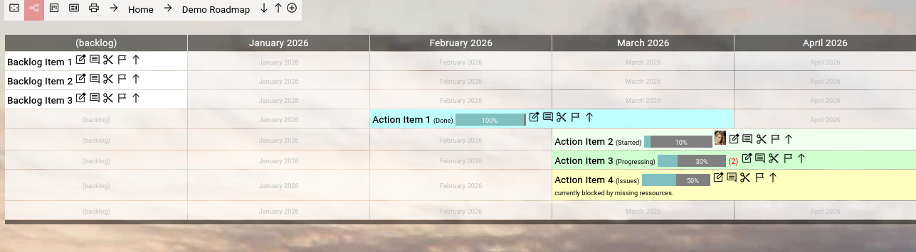
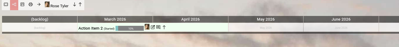
The  "Cut" button is only available, if you have write access to the topic. "Cut" button is only available, if you have write access to the topic.
It allows you to cut a topic with one click to your personal clipboard.
The topic will immediately disappear from the roadmap and you will notice a new information at the right end of the breadcrumb:
(Focus™ Breadcrumb with one topic in the personal clipboard)
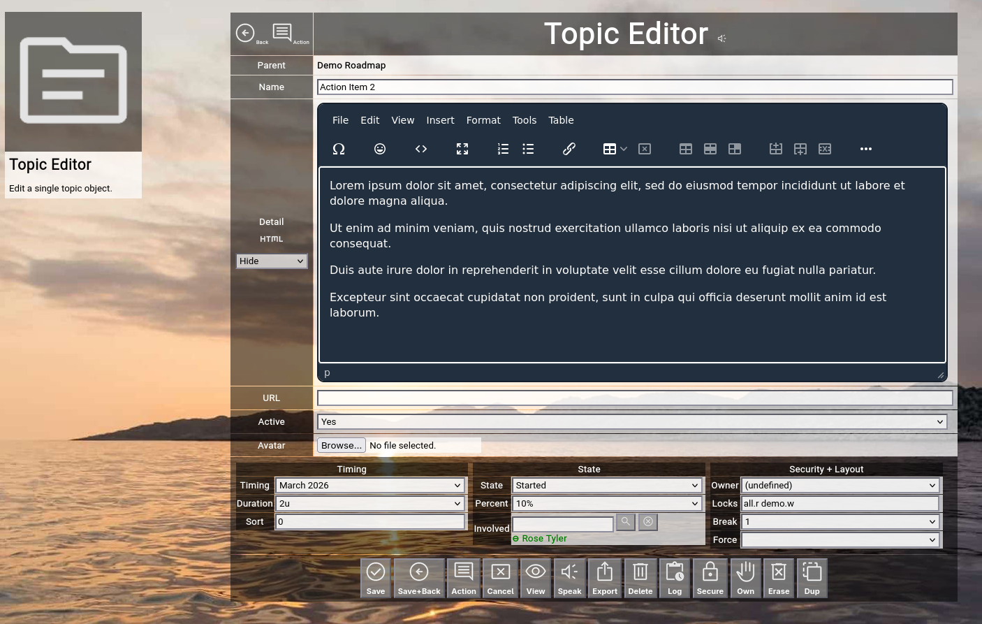
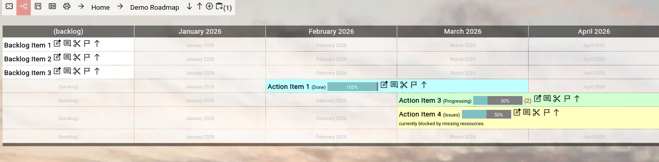
In the above example we clicked on the "Cut" button of the "Action Item 2" and there now is a  "Paste" button with the number of topics in the clipboard visible at the right end of the breadcrumb. "Paste" button with the number of topics in the clipboard visible at the right end of the breadcrumb.
You can now simply click on the "Paste" button to paste the topic in the clipboard into the curently focused topic (which is the roadmap in this case).
The screen will look as before:
(Focus™ Roadmap View after re-pasting the "Action Item 2")
You can cut multiple topics from different positions on your roadmap (or even other roadmaps) to your personal clipboard, before pasting them into one focused topic.
This allows you for example to quickly cut 3 topics from your roadmap, create another additional "container" topic, drill into the new "container" topic and paste all 3 topics there.
This would effectively group the items together into some kind of "subroadmap".
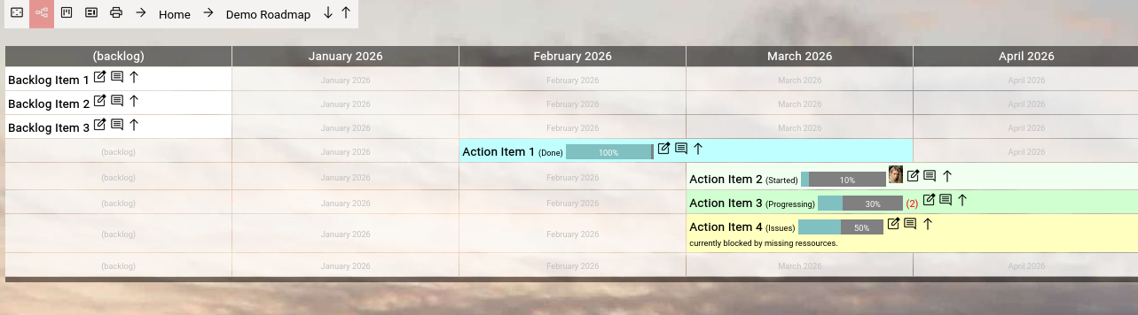
The  "Flag" button is only available, if you have write access to the topic. "Flag" button is only available, if you have write access to the topic.
It allows you to flag a topic on the roadmap with a  "flag" icon in front of its name. "flag" icon in front of its name.
If you click the "Flag" button again, you will remove the flag from the topic again (so it works like a toggle button).
This functionality can be used for a simple but extremely useful pattern:
While working with your roadmap you can hilite a number of topics which you want to talk about later in a review meeting for communication and decision making purposes.
The "Open/Close" button allows you to open or close any topic on the roadmap.
An "open" topic is an alternative to drilling into it and just viewing its content.
If a topic is open, its content will be shown on the roadmap just below the opened topic (enclosed by dark separator bars).
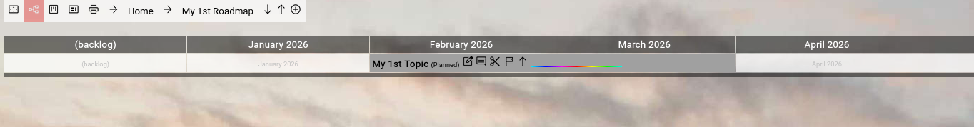
If a topic is closed and contains other topics inside, a small red number (which shows the number of topics inside) will be shown right next to it:
(Focus™ Roadmap View with one closed topic having topics inside)
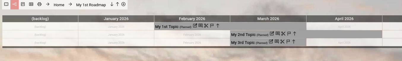
If you now click on the "Open" button next to "3rd Topic", the result will look like this:
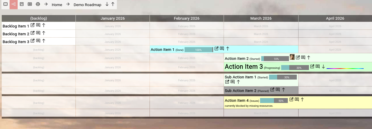
(Focus™ Roadmap View with one open topic having topics inside)
The name of the open topic will be rendered in a larger font and you see the 2 topics enclosed by dark separator bars.
The "Open" button has turned into a "Close" button and if you click it, the screen will again look as before.
The open/close state of topics is being held in your user account.
So your open/close state will not effect what other users see in the roadmap.
They can have their own individual view.
We recommend to use the open/close feature sparingly and only on structured roadmaps.
Otherwise you will create a chaotic view of mixed open and closed items and you will loose perspective.
It is usually better to drill into a topic to focus on the subtopics and then go up with the help of the breadcrumb again.
It provides more focus.
Roadmap-related Settings
The settings screen (which can be opened by clicking on the  "Settings" button in the upper-right corner of the top-level menubar) provides a couple of relevant options which influence the rendering of the roadmap: "Settings" button in the upper-right corner of the top-level menubar) provides a couple of relevant options which influence the rendering of the roadmap:
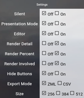
(Focus™ Settings Screen)
- The Presentation Mode setting works the same as the left-most toggle button on the breadcrumb.
It activates or deactivates presentation mode (no top-level menubar, no immediately visible buttons).
- The Render Detail setting globally enables or disables the rendering of the content of the detail attribute of topics on the roadmap.
The default is "On".
But content will only be rendered, if it is configured as "OnRoadmap" or "OnBoth" in the inidividual topic.
- The Render Percent setting enables or disables the rendering of the estimated percent completion bar in the roadmap.
The default is "On".
- The Render Involved setting enables or disables the rendering of involved people with the topic in the roadmap.
The default is "On".
- The Hide Buttons setting allows you to hide all buttons in the roadmap by default, independent of presentation mode.
If you like the uncluttered view of the roadmap, you can use this.
The default is "Off".
- The Size setting allows you to configure the horizontal size of a timing slot on the roadmap.
If you notoriously use long names for topics, you can up-to double the horizontal size.
The larger your timing slot is, the less timing slots are visible on the screen.
So it is a trade off.
MyRoadmap View
If you create large roadmaps (and even multiple roadmaps) and involve yourself and people from your team with topics on the roadmap, at some point you need to change the perspective to get an overview of all the topics, into which you (or another team member) is involved (all over the roadmap and all over all the roadmaps).
To achive this, there is a view which is quite similar to the roadmap view, but the top level does not focus on a roadmap.
It focuses on a user and renders all the topics into which the user is involved.
The view thus effectively creates your own personal "cross-roadmap" roadmap and it even allows you to edit to some degree.
The only thing which you cannot do (in comparism to the classic roadmap view) is to add a new top-level topic, because your top-level can span multiple roadmaps and even multiple levels inside of the roadmap, so it does not make sense.
For that, you have to switch to classic roadmap view by clicking on the name of a topic and cross-drill into the related classic roadmap view.
The MyRoadmap view can be invoked for yourself by either clicking on the  "MyRoadmap" button in the home screen, the main menu or in the top-level menubar. "MyRoadmap" button in the home screen, the main menu or in the top-level menubar.
To invoke the MyRoadmap view for someone else, you can do a quick search with the search function from the top-level menubar, use the user browser from the home screen or the main menu or just click on the avatar of an involved person in roadmap view.
These views are always created in a separate additional browser tab, to that they do not destroy your current context.
(Focus™ MyRoadmap View)
Print View
Sometimes you want to provide other people outside of your team with a view on your roadmap.
Naturally, you could give them read only access to your Focus™ roadmap, but this would require to give them access to the Focus™ app by providing them a user account.
In many cases this may not be desirable, especially if the people are outside of your organization.
For this case you can use the print view of a roadmap.
The "Print" button is available in the left part of the breadcrumb of the roadmap and the myroadmap view.
Clicking it will create a new browser tab, which renders your current roadmap view in an easily printable version.
Just invoke the print function of your browser, select landscape mode, make sure that the background image is printed (there is usually a checkbox for that), adjust the scale if neccessary (make sure that everything fits nicely on the pages) and finally print it as a PDF file.
This PDF file can be distributed independent of the Focus™ app to the interested audience.
What is included in the print view?
The print view first of all renders the detailed information of the currently focused object (usually your roadmap, a folder or category within the roadmap, or a sub-roadmap).
Immediately below it shows a complete overview of the entire focused roadmap or sub-roadmap (all items below on the timeline, honoring the open/close state of each item).
After that, page-by-page, it shows all the items below (again honoring the open/close state of each item) and renders the detailed information, the single item on the roadmap and all the actions associated with the item.
So the printed PDF works much like a snapshot of a diary of your roadmap or subset of your roadmap.
It can be used to update your audience about the latest developments in your roadmap items.
Attachments (avatars) and URLs
As the PDF should work independent of the Focus™ application, attachment links are not included, as they would require a user account and access to the Focus™ application.
URLs on the other hand are included, as they usually point to 3rd party systems (Atlassian Confluence™, Microsoft Teams™, Microsoft Sharepoint™, Google Worksplace™, websites on the Internet or whatever else is used in your company).
Topic Actions
Topic actions work like a diary for the individual topic, where you can record relevant activities performed in the context of the topic (major achievements, steps forward, drawbacks and results).
You can reach this view either directly from the roadmap view or from the topic editor by clicking on the "Action" button next to a topic (or in the left-upper corner, in case of the topic editor screen).
Initially, you will face an empty screen:
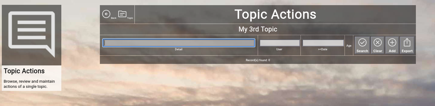
(Focus™ Topic Actions)
To create a new action, simply click the "Add" button.
A new and empty action will open:
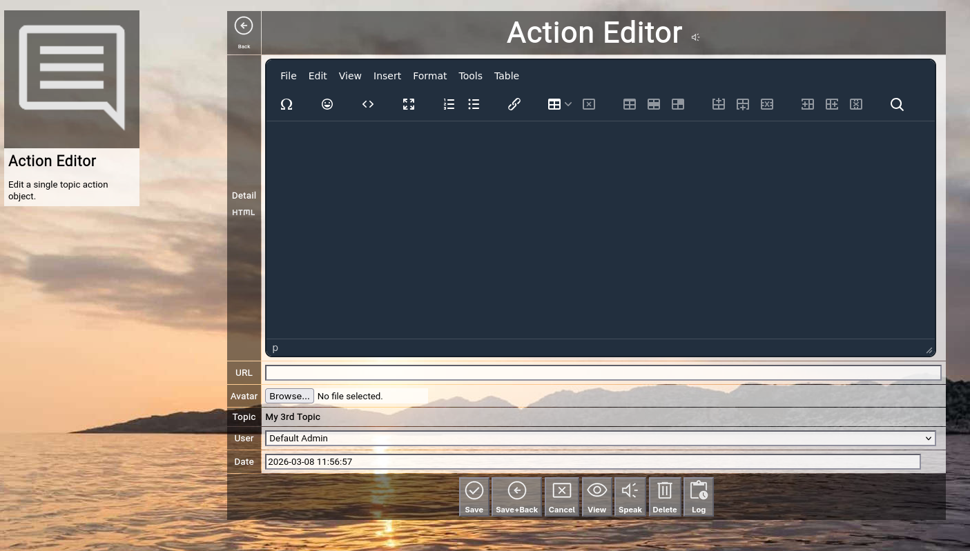
(Focus™ Topic Action Editor)
Here is an overview of the attributes of an action, which you can fill in:
- Detail
The detail of an action.
Much like the detail of a topic, it can be anything from one sentence up to a full HTML-formatted document.
On the left, just below the "Detail" label, you can see the "Plain" icon.
This allows you to toggle the embedded HTML WYSIWYG editor (explained later).
- URL
The optional URL of an action.
If you paste an URL here, it will be displayed as a link icon in the action list (you can use this to for example point to existing documentation in a Wiki or to a related ticket in a ticketing system).
- Avatar
An optional attachment to the action.
If you select a JPG, PNG or GIF file here, it will be rendered as an avatar left of the detail of the action in the action list.
If you select for example a PDF file, a download button will be shown instead.
To upload an attachment, just select a local file and save the action later in your edit cycle.
- Topic, User + Date
These are read-only fields further specifying the action (automatically generated from the context, user creating the action and the timestamp of its creation).
If you have administrative privileges, you are able to edit the user and date field for correction purposes.
The following buttons are available at the bottom of the screen:
- The "Save" button will just save your changes (without leaving the editor screen).
This is only possible with write access level to the topic.
- The "Save+Back" button will do the same but return to the previous screen.
This is only possible with write access level to the topic.
- The "Cancel" button will just return to the previous screen (without saving; it functions in the same way as the "Back" button in the upper-left corner).
- The "View" button will temporarily switch to "read only" mode, so that you can for example easily read long HTML-formatted details.
This is only relevant, if you have write access to the topic; if you only have read access, it will show "read only" mode anyway.
- The "Speak" button will try to speak the action details with the help of the browser speech synthesis API (which is an experimental feature of Focus™ at the moment).
- The "Delete" button will request confirmation, will delete the record and then will return to the previous screen.
Note: Deleting an action is only possible, if the action is not yet used somewhere in Focus™ already; if this is the case, you will see an appropriate error message.
Furthermore, this is only possible with write access level to the topic.
- The "Log" button will show the full historical transaction log for the topic (who+when+what regarding updates).
This can be used for example to clarify who in the team update the description or something like that.
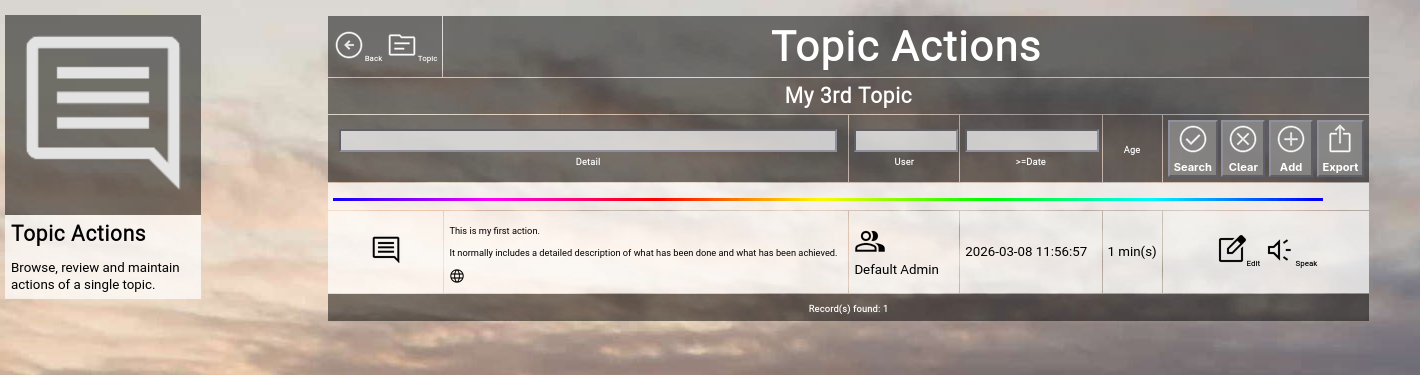
(Focus™ Topic Actions after creating the 1st action)
If you and other team members have added a large number of actions, the list grows quite long.
If you search for something special, you can additionally filter the view by entering part of the detail, part of a user name or a date limit (to show only newer entries).
Click the "Search" button to search and bring the additionally entered filters in effect, click the "Clear" button to remove all active filters again.
You can also export the entire view in either ZML-format (which can be re-imported by an administrator) or in CSV-format (which can be imported into a spreadsheet program like Excel™).
Using the HTML Editor
Focus™ includes the 3rd party open source embedded HTML WYSIWYG editor "TinyMCE".
The topic editor and the action editor both allow you to enable it to write full-fledged HTML documents for the detailed description of a topic or an action.
Here is an example of the topic editor in normal mode:
(Focus™ Topic Editor with plain details by default)
You can now click on the "Plain" button to toggle to HTML editor mode:
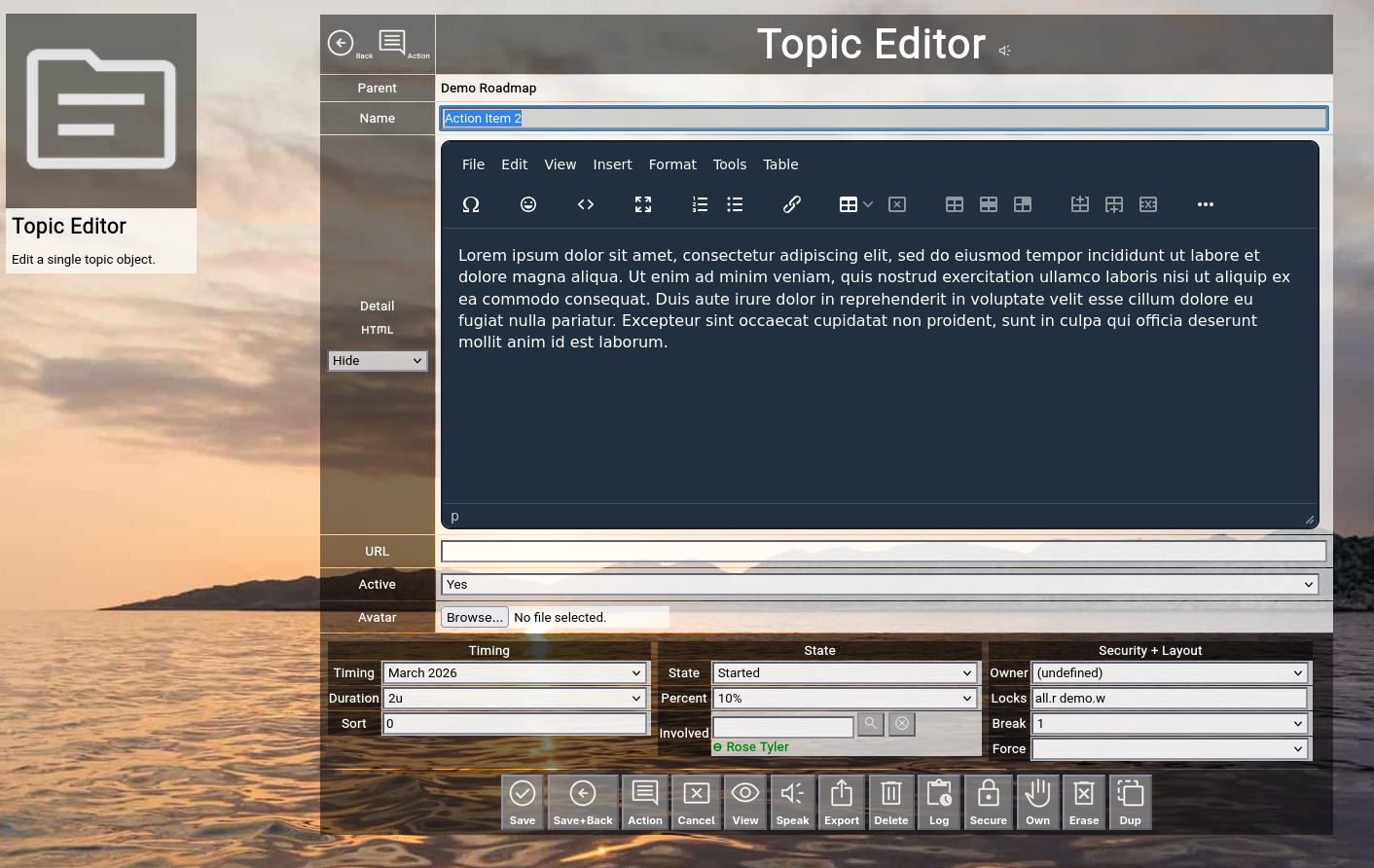
(Focus™ Topic Editor with HTML details in HTML editor)
Explaining the TinyMCE editor in detail is beyond the scope of this manual.
But it is easy to get acquainted by exploring the different available dropdown menus.
If you prefer plain text mode, there is one additional information:
The special character | (vertical bar) forces a linefeed in the rendering in read-only mode.
This is helpful to break lines, if you want to include the detail for example in the rendering of the roadmap.
Speech Synthesis
The latest versions of Focus™ include an experimental feature, which allows you to read aloud the details of a topic or the details of an action by utilizing the speech synthesis of modern browsers.
This is helpful during a presentation of your roadmap (or of the current state of your roadmap), as it frees you from reading these items yourself to the audience.
Depending on the browser you are using, this might produce mixed results.
Some browsers (for example Firefox™) use traditional operating system provided speech synthesis services (for example open source "eSpeak" or "eSpeak NG"), which may sound quiet "robotic".
Other browsers (for example Google Chrome™ or Microsoft Edge™) use more advanced AI-based speech synthesis (often as an Internet service), which usually sounds like a natural speaker.
Some browsers may not provide this service at all; in this case you will simply hear nothing from your speakers.
Using this feature also requires you to configure the language which is usually used (for example english or german), which is configurable in your focus.ini configuration file.
We encourage you to experiment with this feature and provide feedback to us.
This completes the introductionary part of the "Topics, Roadmaps, Actions" Manual.
The next section deals with additional browsers, which provide additional cross-roadmap search capabilities.
They are optional and you can treat the following section as "read on demand".
Topics
The topic browser allows users to browse and view all the topics in your Focus™ instance in list format.
It can also be seen as an "extended search", as it allows more distinct topic attributes to be used as filters.
To invoke the topic browser, select "Topics" from either the main menu or from the home page:
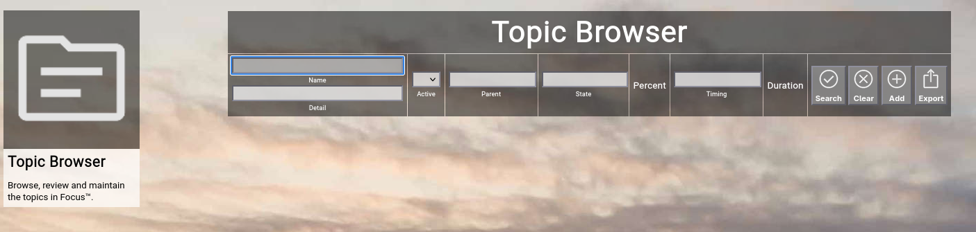
(Focus™ Topic Browser)
Searching & Filtering for Topics
The topic browser allows you to search and filter for the following topic attributes:
- Name
Enter part of a topic name.
- Detail
Enter a phrase occuring in the details of a topic.
- Active
Select whether you want to see all topics, only active topics or only inactive topics.
- Parent
Enter part of the name of a parent topic.
- State
Enter part of a topic state name (e.g. "progressing").
- Timing
Enter part of a timing name of a topic (e.g. "2024").
Click the "Search" button to perform the search or click the "Clear" button to reset the already entered search criteria.
Exporting Topics
If you are an administrative user, you can export the currently filtered list of topics in ZML format to a local file.
Click on the "Export" button to perform the export.
A file named "export_topic.zml" or "export_topic.csv" (depending on the export mode settings in the settings screen) will be created in your local "Downloads" directory.
Adding a New Topic
To add a new topic, click the "Add" button.
Note that using the "Add" button in the topic browser will always create new topics located below the top-most "Home" topic.
Please use the "Add" buttons in the roadmap view to create topics in other contexts.
The attributes available in a topic have already been explained in a previous chapter in this getting started guide.
Please refer to the "Editing a Topic" chapter for more details.
At the bottom of the screen, a couple of buttons are available:
- The "Save" button will just save your changes (without leaving the editor screen).
- The "Save+Back" button will do the same but return to the previous screen.
- The "Cancel" button will just return to the previous screen (without saving).
- The "Delete" button will request confirmation, will delete the record and then will return to the previous screen.
Note: Deleting a topic is only possible, if the topic is not yet used somewhere in Focus™ already; if this is the case, you will see an appropriate error message.
- The "Log" button will show a historical transaction log of the current record (for auditing purposes).
Editing an Existing Topic
To edit an existing topic, click the "Edit" button next to the topic in the list shown in the topic browser after searching.
Focusing on a Topic or a Parent Topic
You can focus on a topic or a parent topic (and invoke the roadmap view) by clicking on the name of a topic or the name of a parent topic in the list shown in the topic browser after searching.
Involved
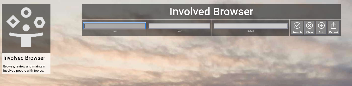
The involved browser allows users to browse and view all the user involvements over all the topics in your Focus™ instance in list format.
To invoke the involved browser, select "Involved" from either the main menu or from the home page:
(Focus™ Involved Browser)
Searching & Filtering for Involvements
The involved browser allows you to search and filter for the following involvement attributes:
- Topic
Enter part of the topic name associated with the involvement.
- User
Enter part of a user name belonging to an involvement.
- Detail
Enter a phrase occuring in the details of an involvement.
Click the "Search" button to perform the search or click the "Clear" button to reset the already entered search criteria.
Exporting Involvements
If you are an administrative user, you can export the currently filtered list of teams in ZML format to a local file.
Click on the "Export" button to perform the export.
A file named "export_involved.zml" or "export_involved.csv" (depending on the export mode settings in the settings screen) will be created in your local "Downloads" directory.
Adding a New Involvement
To add a new involvement, click the "Add" button.
Note that using the "Add" button in the involved browser will always create new involvement for the top-most "Home" topic.
Please use the "Topic Involved" function in the context of a single topic to add involvements to a specific topic.
The attributes available in an involvement have already been explained in a previous chapter in this getting started guide.
Please refer to the "Building Involvements" chapter for more details.
At the bottom of the screen, a couple of buttons are available:
- The "Save" button will just save your changes (without leaving the editor screen).
- The "Save+Back" button will do the same but return to the previous screen.
- The "Cancel" button will just return to the previous screen (without saving).
- The "Delete" button will request confirmation, will delete the record and then will return to the previous screen.
Note: Deleting an involvement is only possible, if the involvement is not yet used somewhere in Focus™ already; if this is the case, you will see an appropriate error message.
- The "Log" button will show a historical transaction log of the current record (for auditing purposes).
Editing an Existing Involvement
To edit an existing involvement, click the "Edit" button next to the involvement in the list shown in the involved browser after searching.
Viewing the Involvements for a Topic
You can focus on the involvements of a single topic by clicking on the name of a topic in the list shown in the involved browser after searching.
Viewing the Users of an Involvement
You can view the details of an involved user by clicking on the name of a user in the list shown in the involved browser after searching.
Actions
The action browser allows users to browse and view all the actions over all the topics in your Focus™ instance in list format.
To invoke the action browser, select "Actions" from either the main menu or from the home page:
(Focus™ Action Browser)
Searching & Filtering for Actions
The action browser allows you to search and filter for the following action attributes:
- Detail
Enter a phrase occuring in the details of an action.
- Topic
Enter part of the topic name.
- User
Enter part of a user name of an action (who created the action).
- >=Date
Enter a starting date, from which onwards you want to filter the actions.
Click the "Search" button to perform the search or click the "Clear" button to reset the already entered search criteria.
Exporting Actions
If you are an administrative user, you can export the currently filtered list of actions in ZML format to a local file.
Click on the "Export" button to perform the export.
A file named "export_action.zml" or "export_action.csv" (depending on the export mode settings in the settings screen) will be created in your local "Downloads" directory.
Adding a New Action
To add a new action, click the "Add" button.
Note that using the "Add" button in the action browser will always create new actions for the top-most "Home" topic.
Please use the "Topic Actions" function in the context of a single topic to add actions to a specific topic.
The attributes available in an action have already been explained in a previous chapter in this getting started guide.
Please refer to the "Working with Topic Actions" chapter for more details.
At the bottom of the screen, a couple of buttons are available:
- The "Save" button will just save your changes (without leaving the editor screen).
- The "Save+Back" button will do the same but return to the previous screen.
- The "Cancel" button will just return to the previous screen (without saving).
- The "Delete" button will request confirmation, will delete the record and then will return to the previous screen.
Note: Deleting an action is only possible, if the action is not yet used somewhere in Focus™ already; if this is the case, you will see an appropriate error message.
- The "Log" button will show a historical transaction log of the current record (for auditing purposes).
Editing an Existing Action
To edit an existing action, click the "Edit" button next to the action in the list shown in the action browser after searching.
Viewing Actions for a Topic
You can focus on the actions of a single topic by clicking on the name of a topic in the list shown in the action browser after searching.
Viewing the Author of an Action
You can view the details of an author of an action by clicking on the name of a user in the list shown in the action browser after searching.
Users
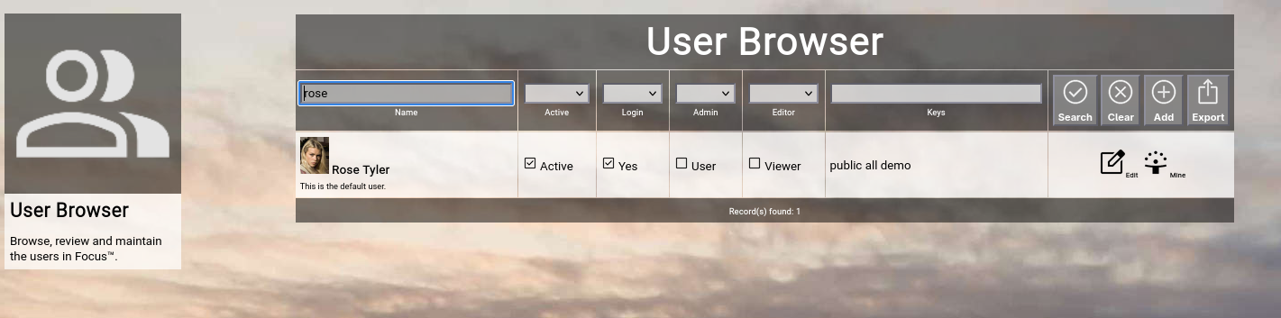
The user browser allows normal users to browse and view the available people in your Focus™ instance and allows administrative users to maintain people (create, update and delete).
To invoke the user browser, select Users from either the main menu or from the home page:
(Focus™ user browser)
Searching & Filtering for Users
The user browser allows you to search and filter for the following user attributes:
- Name
Enter part of a user name.
- Active
Select whether you want to see all users, only active users or only inactive users.
- Admin
Select whether you want to see all users, only administrative users or only non-administrative users.
- Editor
Select whether you want to see all users, only editing users or only read-only users.
- Keys
Enter part of the keys of a user.
Click the Search button to perform the search or click the Clear button to reset the already entered search criteria.
Exporting Users
If you are an administrative user, you can export the currently filtered list of users in ZML or CSV format to a local file.
The preferred export format can be selected in the settings screen (in the upper right corner of the menu bar).
Click on the Export button to perform the export.
A file named export_user.zml or export_user.csv will be created in your local Downloads directory.
Note:
Be careful with such a file, because it also includes the secret personal certificates of the users.
Adding a New User
To add a new user, click the Add button.
The new user editor screen will appear:
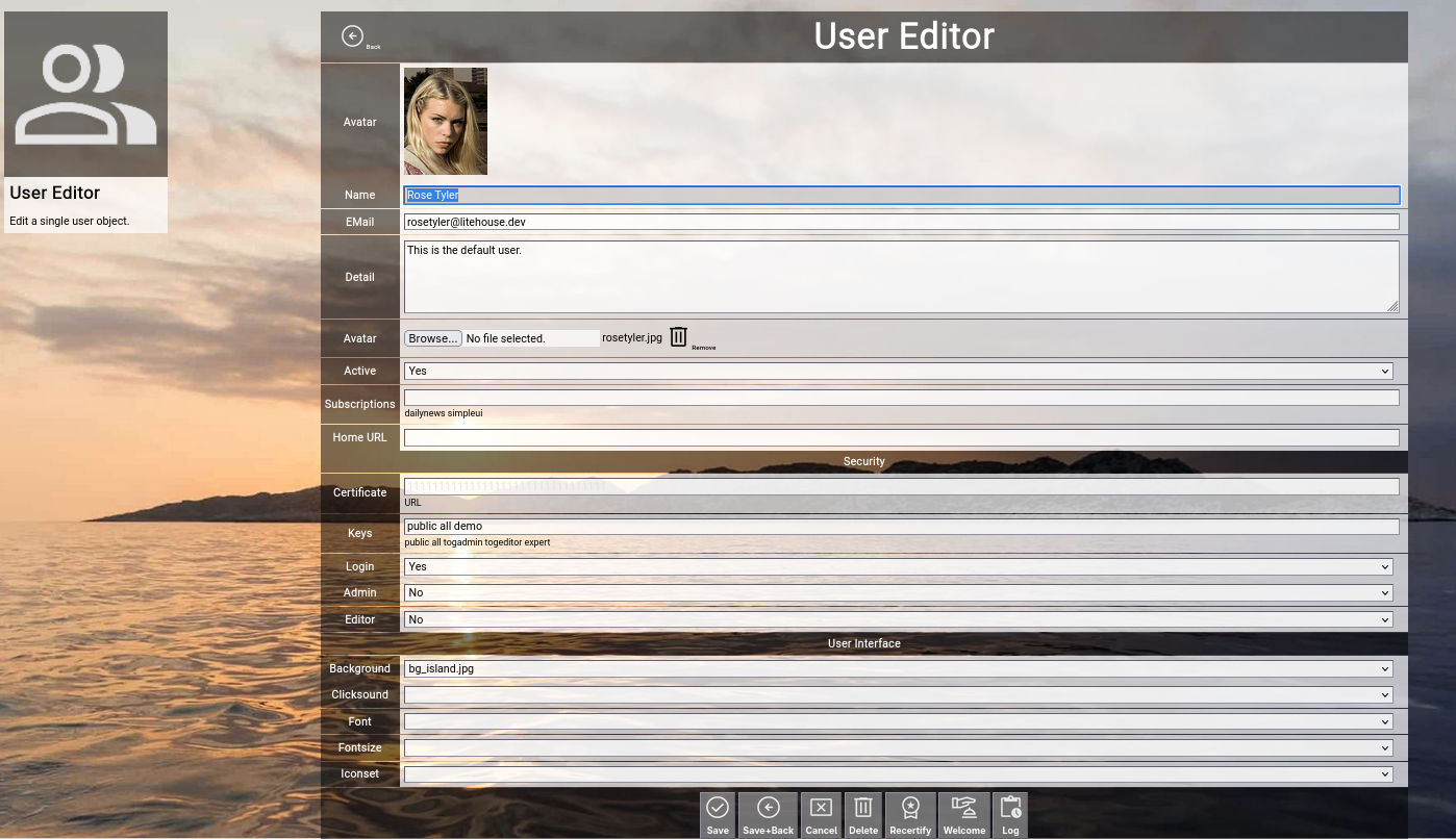
(Focus™ user editor screen)
Let us have a look at the different available attributes of a user:
- Name
The Name of a user represents its combination of first and last name.
It is always shown in the different views in Focus™ involving people.
This field can also be edited by the user him- or herself with the help of the profile screen.
- EMail
The optional EMail address of a user is required, if the person should be able to use Focus™ (the email address is used to recover the personal secret certificate to login).
For people who do not directly use Focus™, the email address is optional and only has informational character.
This field can also be edited by the user him- or herself with the help of the profile screen.
- Detail
The optional Detail of a user is a full text description, optionally formatted in HTML.
You can enter HTML tags directly (e.g. if you want to underline something in the text, you can include it in tags).
This field can also be edited by the user him- or herself with the help of the profile screen.
- Avatar
The optional Avatar of a user allows you to upload an image file (.png, .jpg or .gif format) to the user, which will be shown as a kind of avatar in the different views in Focus™.
You have to click on the Browse button to select an image file from a local directory.
This field can also be edited by the user him- or herself with the help of the profile screen.
- Active
The Active toggle of a user can be used to disable (or enable) a person.
Disabled users are shown in strike-out format in the user browser.
To be able to login to Focus™, a user must be enabled.
Immediately after using the register screen (self registration), the new user record is disabled and needs approval by an administrator to be enabled.
Setting a user to inactive can be used as some kind of soft delete.
- Subscriptions
The Subscriptions of a user optionally contain a list of subscription toggles (enclosed in vertical bars, for example |dailynews|).
Subscriptions can be managed by the user him- or herself with the help of the profile screen.
- Home URL
The optional home URL allows you to set a custom URL, which will be used for the "Main" buttons in the home screen, in the menu and in the top level menu bar.
If the user subscribed to the simplified UI, this will also replace the link from the splash screen.
- SECURITY
- Certificate
The Certificate of a user is a secret 32 character string, which should only be shared with the user him- or herself, as it is the key which is needed to login to Focus™.
Focus™ does not provide a standard username+password approach; only this secret key is needed to login and it can be obtained with the recover screen via email.
The certifcate cannot be edited and is visible only to administrators in ghosted (difficult to read) format, which enables mark, copy and paste.
- Keys
The Keys of a user contain a space-delimited list of security access keys, which are in the possession of the user.
For more information about the concept of ownership, keys and locks, please visit the Securing a Topic chapter further up in this getting-started-guide.
A reasonable default is the all key; it signals that topic content made available to all users of the Focus™ instance can be accessed.
- Login
The Login toggle of a user defines whether a user can login to Focus™ or not.
By default, users are only persons, who can be used to assign in teams and cannot work with Focus™.
- Admin
The Admin toggle of a user defines whether a user is a normal user (disabled) or an administrative user (enabled).
Administrative users have full access to all topics (independent of topic ownership and locks configuration) and can perform full configuration of the Focus™ instance (including the maintenance of user accounts).
- Editor
The Editor toggle of a user defines whether a user can contribute and modify topic content (enabled) or can only view content (disabled).
This setting overrides any ownership or locks configuration; if a user is not an editor, he or she cannot add, edit or delete topic content at all.
- USER INTERFACE
- Background
The optional Background of a user allows you to select a different background image in Focus™.
- Clicksound
The optional Clicksound of a user allows you to select a different clicking confirmation sound when making selections in Focus™.
- Iconset
The optional Iconset of a user allows you to select a different set of icons in Focus™.
Note: As Focus™ caches all icons in the browser (for performance reasons), this change is not immediate.
It may take up to 10 minutes for all new icons to appear (be patient).
- Font
The optional Font of a user allows you to select a different true type font in Focus™.
- Fontsize
The optional Fontsize of a user allows you to select a different default font size in Focus™.
The default is usually 10pt.
At the bottom of the screen, a couple of buttons are available:
- The Save button will just save your changes (without leaving the editor screen).
- The Save+Back button will do the same but return to the previous screen.
- The Cancel button will just return to the previous screen (without saving).
-
- The Delete button will request confirmation, will delete the record and then will return to the previous screen.
Note: Deleting a user is only possible, if the user is not yet used somewhere in Focus™ already; if this is the case, you will see an appropriate error message.
- The Log button will show a historical transaction log of the current record (for auditing purposes).
Recertifying a User (as an administrator)
If you are an administrator, you will see an additional button called Recertify button.
If you click this button, Focus™ will ask for confirmation and then will create a new random secret personal certificate for the user.
This will immediately invalidate any sessions of this user and the user has to re-login with the new certificate.
This is helpful if you suspect that a user account has been compromised and you want to re-establish proper security for the user in question.
Welcoming a User (as an administrator)
If you are an administrator, you will see an additional button called Welcome button.
If you click this button, Focus™ will ask for confirmation and then will send a welcome email to the email address of the user, including a personalized link to login (including the secret personal certificate).
This is helpful if you want to push-onboard the user either after self registration with the help of the register screen (and you just verified the user and set active=yes) or if you added the new user manually.
Editing an Existing User
To edit an existing user, click the Edit button next to the user in the list shown in the user browser after searching.
This completes the section about the additional browsers in Focus™.
The next section deals with configuration functions, which are usually only used by system administrators.
As a normal user, you can browse the configuration for a better understanding, but usage is completely optional.
Timings
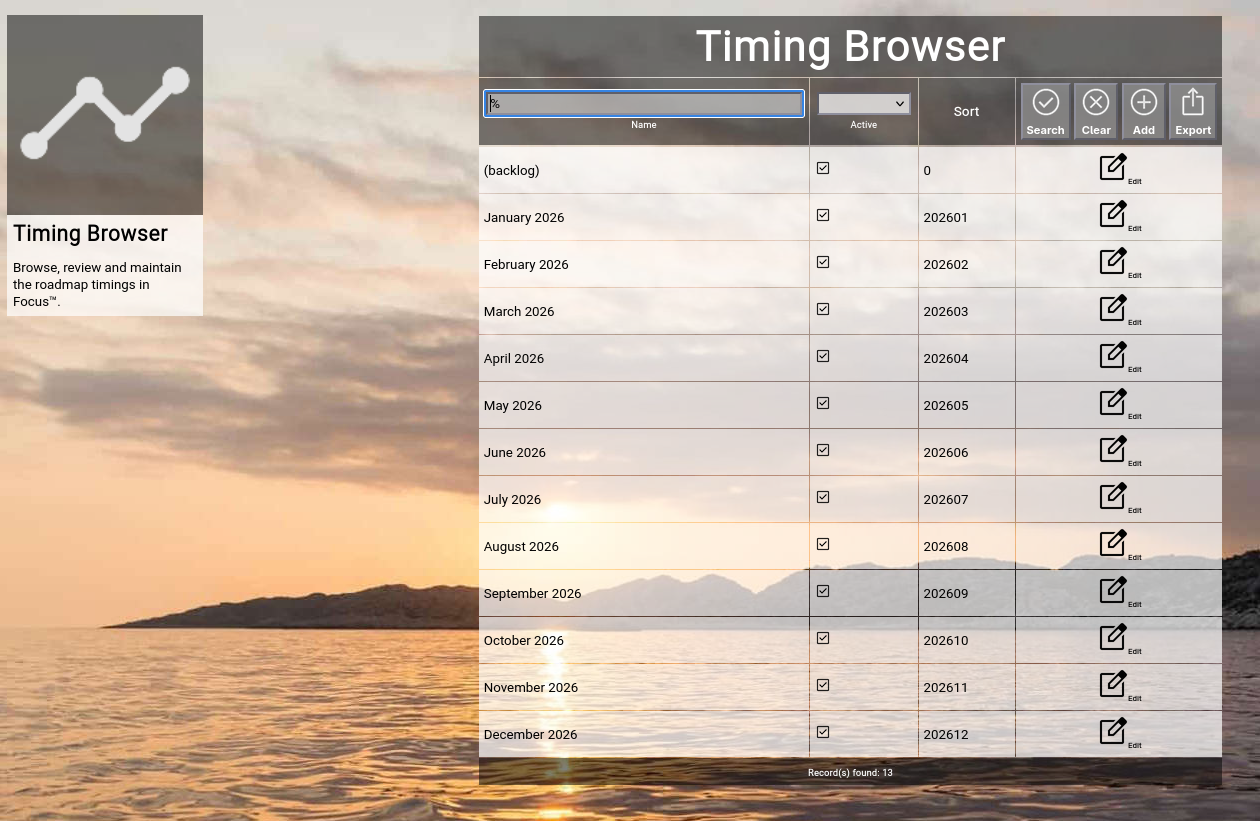
The timing browser allows normal users to browse and view the available time dimensions for topics on roadmaps in your Focus™ instance and allows administrative users to maintain these (create, update and delete).
To invoke the timing browser, select Timings from either the main menu or from the home page:
(Focus™ timing browser)
Searching & Filtering for Timings
The timing browser allows you to search and filter for the following timing attributes:
- Name
Enter part of a timing name.
- Active
Select whether you want to see all timings, only active timings or only inactive timings.
Click the Search button to perform the search or click the Clear button to reset the already entered search criteria.
Exporting Timings
If you are an administrative user, you can export the currently filtered list of timings in ZML or CSV format to a local file.
Click on the Export button to perform the export.
A file named "export_timing.zml" or "export_timing.csv" will be created in your local Downloads directory.
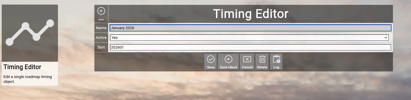
Adding a New Timing
To add a new timing, click the Add button.
The new timing editor screen will appear:
(Focus™ timing editor screen)
Let us have a look at the different available attributes of a timing:
- Name
The Name of a timing represents a short and easy-to-understand label for the time slot.
Note: Please assure that the timing name is in a sortable format.
Naming your month-granularity timing for example 2024-04 April assures that all the years and months are in the right sequence (as the timing-related screens in Focus™ all sort by the name of the timing).
- Active
The Active toggle of a timing can be used to disable (or enable) a timing.
Disabled timings are not available in the various views or drop-down boxes of Focus™.
Setting a timing to inactive can be used as some kind of soft delete.
- Sort
The Sort of a timing is a numeric value which defines the order among all the timing slots.
You should format this according to some logical numeric sequence, for example YYYYMM = 202601.
As the sorting is independent of the timing name, you can use any name you like without influencing the order of sequence.
At the bottom of the screen, a couple of buttons are available:
- The Save button will just save your changes (without leaving the editor screen).
- The Save+Back button will do the same but return to the previous screen.
- The Cancel button will just return to the previous screen (without saving).
- The Delete button will request confirmation, will delete the record and then will return to the previous screen.
Note: Deleting a timing is only possible, if the timing is not yet used somewhere in Focus™ already; if this is the case, you will see an appropriate error message.
The Log button will show a historical transaction log of the current record (for auditing purposes).
Editing an Existing Timing
To edit an existing timing, click the Edit button next to the timing in the list shown in the timing browser after searching.
States
The state browser allows normal users to browse and view the available topic states in your Focus™ instance and allows administrative users to maintain these (create, update and delete).
To invoke the state browser, select States from either the main menu or from the home page:
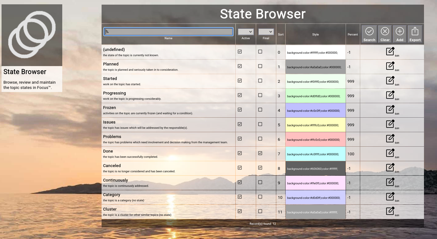
(Focus™ state browser)
Searching & Filtering for States
The state browser allows you to search and filter for the following state attributes:
- Name
Enter part of a state name.
- Active
Select whether you want to see all states, only active states or only inactive states.
- Final
Select whether you want to see all states, only final states or only progressional states.
Click the Search button to perform the search or click the Clear button to reset the already entered search criteria.
Exporting States
If you are an administrative user, you can export the currently filtered list of states in ZML format to a local file.
Click on the Export button to perform the export.
A file named export_state.txt will be created in your local Downloads directory.
Adding a New State
To add a new state, click the Add button.
The new state editor screen will appear:
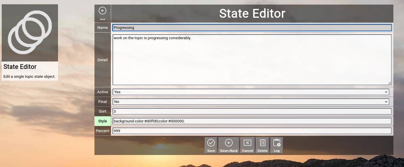
(Focus™ state editor screen)
Let us have a look at the different available attributes of a state:
- Name
The Name of a state represents a short and easy-to-understand label for the state.
- Detail
The optional Detail of a state is a full text description, optionally formatted in HTML.
You can enter HTML tags directly (e.g. if you want to underline something in the text, you can include it in tags).
- Active
The Active toggle of a state can be used to disable (or enable) a state.
Disabled states are not available in the various views or drop-down boxes of Focus™.
Setting a state to inactive can be used as some kind of soft delete.
- Final
The Final toggle of a state designates that a state represents completion.
Completional states are for example done or canceled.
The opposite of the completional state is the progressional state.
A progressional state is for example running.
- Sort
The Sort of a state is a numeric value which directly influences the sort order of states in the different views of Focus™.
This order is honored for example by the state drop-down boxes and by the Kanbanboard view.
- Style
The Style of a state is an optional HTML style definition, which allows you to color-highlight your states.
For example, if you enter background-color:#000000;color:#ff0000; here, you will get the state in red color on black background.
- Percent
The optional Percent of a state defines, whether a state change of a topic will automatically set the completion percentage (or not).
The default is -1 and means that no change will take place.
Selecting a percentage will automatically set this percentage when you select a new state for a topic.
A typical example is the done state; it automatically sets 100 as the percentage.
At the bottom of the screen, a couple of buttons are available:
- The Save button will just save your changes (without leaving the editor screen).
- The Save+Back button will do the same but return to the previous screen.
- The Cancel button will just return to the previous screen (without saving).
- The Delete button will request confirmation, will delete the record and then will return to the previous screen.
Note: Deleting a state is only possible, if the state is not yet used somewhere in Focus™ already; if this is the case, you will see an appropriate error message.
- The Log button will show a historical transaction log of the current record (for auditing purposes).
Editing an Existing State
To edit an existing state, click the Edit button next to the state in the list shown in the state browser after searching.
You have reached the end of the "Topics, Roadmaps, Actions" manual.
By now, you should have learned all the essentials to be able to use Focus™ effectively and efficiently.
Have fun!
| 